13/05/24 - 10/06/24 Week 4 - Week 8
Sheren Princessa Davon / 0362134
Advanced Typography / Bachelor of Design (Hons) in Creative Media / Taylor's University
Task 2
LECTURES
Week 5: Perception & OrganizationContrast
- a method of organizing content
- to make design work & its meaning pop out clearly with flair
 |
| Fig 1.2 Different methods of adding contrast |
Carl Dair's Seven Typo Contrasts
- Size
- to draw readers' attention to a certain point
 |
| Fig 1.3 Size contrast |
- Weight
- it describes how bold type can stand out in lighter type of the same style
- helps in creating a power point in a composition
 |
| Fig 1.4 Weight contrast |
- Form
- the distinction between capital & lowercase letters / roman & italic variant / condensed & expanded
 |
| Fig 1.5 Form contrast |
- Texture
- different contrasts of size, weight, form & structure
- it refers to the way lines of type look up close & from a distance
 |
| Fig 1.6 Texture contrast |
- Direction
- the opposition of vertical & horizontal, utilizing different angles
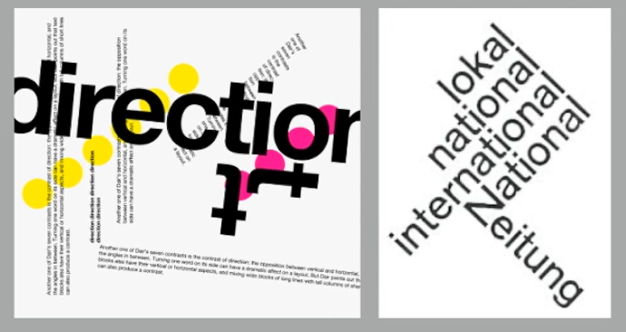 |
| Fig 1.7 Direction contrast |
- Color
- helps highlight certain information that is in color as compared to plain bnw
 |
| Fig 1.8 Color contrast |
- it is the overall look & feel of elements in a typographic composition
- plays a role in visual impact, it leads the eye from point to point
 |
| Fig 1.9 Form |
 |
| Fig 1.20 Form |
- German word meaning the way a thing has been placed/put together
- Gestalt Theory: emphasizes the entirety of anything is greater than its parts
- basically means in a design composition, the components of it is not greater than its overall form
- Law of Similarity: elements that are similar tend to be perceived as a group
- Law of Proximity: elements placed close together tend to be perceived as a unified group
- Law of Closure: the mind's tendency to complete forms/pictures even when they're incomplete/hidden
- Law of (Good) Continuation: people tend to perceive 2 or more objects as different, singular & uninterrupted even when they intercept
 |
| Fig 1.21 Examples of the different laws |
INSTRUCTIONS
Task 2A: Key Artwork
For this task, we are required to create a key artwork based on our first name/last name/pet name/ pseudonym of our name. I chose to use the first 4 letters of my name "SHER".
Mind Map
Firstly, I created a mind map representing myself, some ideas, color schemes and keywords that both represent me and represent who I aspire to be.
Fig 2.1
Sketches
Then, I began sketching different ideas. I explored serif styles, and also "flowy" and bold styles.
 |
| Fig 2.2 Sketches |
Digitization
Then, I started to digitize the letters on Adobe Illustrator.
 |
| Fig 2.3 Digitization #1 |
 |
| Fig 2.4 Digitization #2 |
 |
| Fig 2.5 Key Artwork Draft |
I did several options and finally ended up with Fig 2.5 in which I submitted in class in Week 6 for feedback.
After the feedback session in class, I completely scrapped this idea and got a new idea to create my brand based on who I aspire to be instead.
 |
| Fig 2.6 Sketches #2 |
Digitization
 |
| Fig 2.7 Digitization 2.0 |
I liked the original S design I made, but after I put them all together, I realized that they don't look too cohesive together so I decided to change it up a little. I also used the same downwards stroke in the e and R.
I realized that the 'e' looks like the side profile of a little creature opening its mouth, so I created the swipe on the R to make it seem like the 'e' is "eating" the R. Then, I noticed the S has a similar opening which served as a perfect opportunity for me to "pull" the H into the S, making my final key artwork more balanced. I thought this added a fun, playful element, representing the keywords I aspire to be, both bold yet playful.
Color palette
 |
| Fig 2.8 Colors on the key artwork |
I wanted light colors yet not too strong, so I opted for a light green-blue color palette and one neutral and dark color to balance it out. This way, the colors are professional yet still give off a sense of quirkiness and also softness, to still incorporate who I am currently into my artwork (soft, shy person).
Final Task 2A: Key Artwork
 |
| Fig 2.9 Key Artwork black on white - JPG. Week 7 |
 |
| Fig 2.10 Key Artwork white on black - JPG. Week 7 |
 |
| Fig 2.11 Color Palette - JPG. Week 7 |
 |
| Fig 2.12 Key Artwork colors on lightest color - JPG. Week 7 |
 |
| Fig 2.13 Key Artwork colors on darkest color - JPG. Week 7 |
Fig 2.14 Key Artwork - PDF. Week 7
Task 2B: Key Artwork & Collateral
For Part B of this task, we are tasked to expand our key artworks and apply them to 3 necessary collaterals. At the end, we are also to create an Instagram account with 9 grids to showcase our brand.
Expansion
I started to expand my key artwork and my main idea was to create patterns using the e and R as that was the part I wanted to highlight the most.
 |
| Fig 2.15 Expansion of Key Artwork |
Hence, pattern #1 was created. I took the e and R, duplicated a bunch and created rows of it, alternating it by flipping it horizontally as well as alternating the colors in my color palette. Next I used the upper half of my wordmark (S, H) to create pattern #2. I condensed the S and cut the H into half, duplicated it, flipped it both horizontally and vertically, and alternated the colors, to finally create the pattern.
I also utilized the strokes/shapes used in the e and R to create a simple flower like pattern to act as a small background for a logo I made (SR). I also utilized the same strokes/shapes to create a simple flower vector to utilize for stickers.
I wanted to emphasize the e to act as a mascot/character for my brand, thus I highlighted this and added a flower (also created with the strokes) to show even more characterization.
 |
| Fig 2.16 Portrait |
I took a portrait, edited it to BnW and placed it against pattern #2, I tried to incorporate it into the picture and let some of the elements overlap onto my portrait.
Collateral
Collateral ideas I had was:
Collateral ideas I had was:
- t-shirt/hoodie
- tote bag
- sketchbook
- stickers
- washi tape
 |
| Fig 2.17 Collateral Drafts |
I decided I wanted pattern #1 on a tote bag instead of a hoodie and removed the business card because the other collaterals were more interesting and relevant.
.jpg) |
| Fig 2.18 Final Collaterals |
Instagram Layout
 |
| Fig 2.19 Layout drafts |
Finally, I had to create a layout to showcase my designs and collaterals. I took some time rearranging the layouts, figuring out which ones looked best next to each other to create a cohesive layout.
 |
| Fig 2.20 Final Instagram Layout |
Final Task 2B: Key Artwork & Collateral
Instagram link: https://www.instagram.com/00sher___/
 |
| Fig 3.1 Instagram Screenshot. PNG - Week 8 (10/06/24) |
 |
| Fig 3.2 Instagram Post #1. JPG - Week 8 (10/06/24) |
 |
| Fig 3.3 Instagram Post #2. JPG - Week 8 (10/06/24) |
 |
| Fig 3.4 Instagram Post #3. JPG - Week 8 (10/06/24) |
 |
| Fig 3.5 Instagram Post #4. JPG - Week 8 (10/06/24) |
 |
| Fig 3.6 Instagram Post #5. JPG - Week 8 (10/06/24) |
 |
| Fig 3.7 Instagram Post #5. JPG - Week 8 (10/06/24) |
 |
| Fig 3.8 Instagram Post #6. JPG - Week 8 (10/06/24) |
 |
| Fig 3.9 Instagram Post #7. JPG - Week 8 (10/06/24) |
 |
| Fig 3.10 Instagram Post #8. JPG - Week 8 (10/06/24) |
Fig 3.4 Task 2B Compilation. PDF - Week 8 (10/06/24)
FEEDBACK
Week 5General Feedback
- type must be legible even in small size
- must reflect keywords to represent urself, the core values of our design
- too much white space is a no
Week 6
General Feedback
- properly understand the keywords and what you truly want to express in your design
- wordmark has to match the keywords
Specific Feedback
- ok but not that readable
- reduce size of s
- bring down height of r
- unnecessary 'flicks' on the S and R
- try to explore another idea
Week 7
General Feedback
- choose the right collaterals, make it interesting
- expand your identities more, utilize elements in your key artwork to help
- do some research and look at inspirations of how people expand their identities
REFLECTION
I am grateful that I got a first experience of branding, giving me an idea as to what I can look forward to in my future studies and career.
FURTHER READING
Pentagram Site - https://www.pentagram.com/work/reddit/story
Mr. Vinod shared an article about Reddit's branding and encouraged us to read it to help with our own brand identity expansions.
In 2023, Pentagram worked with Reddit to evaluate its brand positioning with fresh eyes and create a cohesive set of brand methodologies for the future—all while preserving the company’s signature sense of conviviality and joy.
 |
| Fig 4.1 Reddit Branding |
Comments
Post a Comment